")
Beginning Branding for Business Owners: The 3 Things You Need Right from the Beginning
I’m sure you know how important branding is to your business. So then why is it one of the major things that holds back so many people from starting? Honestly, I get it. It’s pretty daunting to figure out how to create great branding from the start, especially when you’re not a designer. And what beginner has the budget to pay one? I certainly didn’t!
Even though branding may not be your expertise, don’t let it hold you back from starting your business. There are so many resources that can help you create beautiful branding from the very start of your business – templates being my number one recommendation.
Today I’m going through the top three things as a new business owner when it comes to branding. Before we start – everything I mention below can be found in my branding + strategy guidelines template. A simple way to get started and have your branding and strategy all in one place. Ok, let’s dig in!
1 The strategy behind your brand (i.e. brand strategy)
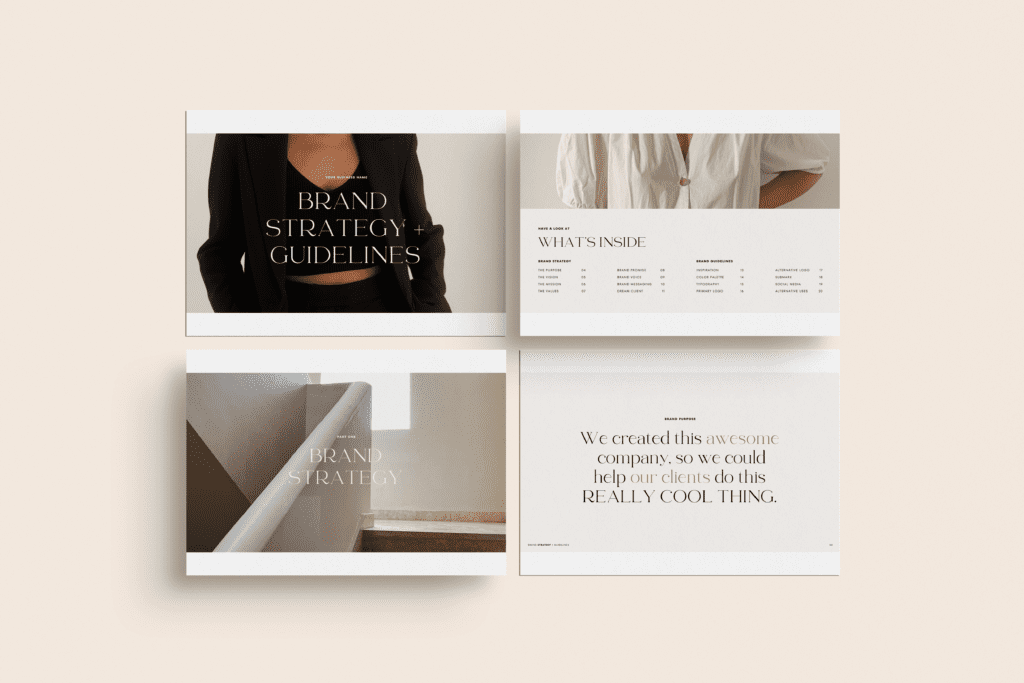
Branding + Strategy Guidelines Template
Wait, strategy instead of actual branding? Not what you expected? Hear me out. As a designer of over 10 years, I feel very strongly that the strategy of your brand has to come before the actual branding. How do you know what you’re trying to get your brand to reflect if you don’t know what your business stands for in the first place?
Sit down and ask yourself the hard questions in the early stages of starting your business. Things like: What is your purpose? Your mission? Vision? Values? Dig deeper and think about your ideal customer. What do they like? What messaging speaks to them? How do they like to consume information? And in what voice?
By figuring out these answers, you’ll begin to understand the depth of your brand early on in your business and in my opinion, there’s no better way to start. You’ll feel confident in the choices you make – branding related or not – because you’ll know exactly what your business stands for and what you’re setting out to achieve.
2 One, preferably two, logos and a submark
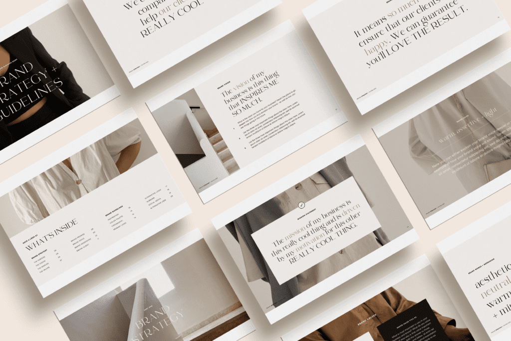
Branding + Strategy Guidelines Template
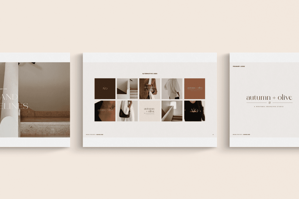
The main logo of your business is called your primary logo. I’d argue that you need this from the very start, even if it’s something super simple. What you choose in the beginning doesn’t need to be your forever logo. That’s the beauty of branding – it evolves. It’s better to have a logo you’re not 100% on than to have nothing at all. Here’s why.
You’ll use your logo everywhere – your website, social channels, business cards if you have them, and anywhere else your brand will appear. A logo is how people will begin to recognize your business. Just remember it doesn’t have to be perfect – it’s very common for logos to change throughout the life of a business.
An additional logo is called a secondary logo and it’s something I recommend having if possible. It won’t be used as much as your primary logo but you’ll find it’s helpful to have. It’s common for your secondary logo to look a lot like your primary logo with just a few simple changes.
Here’s a helpful tip – if your primary logo is pretty long horizontally, make your secondary logo a bit more vertical. This is extremely helpful for branding purposes.
A submark is useful to have as well, for instances where you can’t fit your entire logo but still want to represent your brand. It’s generally pretty simple – an initial or two is super common to see.
Can’t do it all? Just ensure you have a primary logo to begin. A secondary logo and submark can come a bit later.
3 The look and feel of your brand: inspiration, colors, fonts, etc.
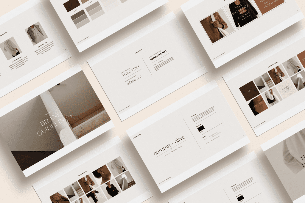
Branding + Strategy Guidelines Template
The most important thing about good branding is consistency. You want to make it easy for people to recognize your brand and for your audience to look at something and instantly know it’s your business. This takes some time to achieve!
It’s hard to create one aspect of your brand at a time, from nothing at all. You can’t start creating a logo if you haven’t developed the look and feel of your brand first. To start, I recommend first finding images that inspire you and “feel” like your brand. You’ll probably have a ton to start, but then you can begin narrowing them down, keeping only what truly embodies your brand. Maybe it’s nature images, flat lay desk images, coffee images, etc. I suggest looking on Pinterest for ideas. These will generally not be photos you take (or have taken) in the beginning stages – that will come later! Just remember, if you’re going to use your brand images publicly, you have to credit the owner of the image.
When choosing a color palette, stick with 5-6 colors. Start with a color or two you know you want to incorporate and then find others that work with them. You don’t need to start from scratch here – in fact, you can find numerous color palettes on Pinterest and even Instagram. I love a neutral color palette with one or two pops of color, but use whatever you prefer!
It’s helpful to have 2 or 3 brand fonts. I recommend using the fonts in your logo, unless they really don’t work in other purposes. You’ll want to ensure you have a header font – something powerful. Perhaps all caps, bold or used only in large sizes. Then you’ll want to have a body font – something that’s easy to read and looks good everywhere, as this is the font you’ll probably end up using most often. If you choose to have a third font, an accent font is fun to have here – something you don’t use all the time but that really steps your branding game up a bit. I love a good script font as an accent font!
Branding can (and will) of course go deeper as your brand evolves, but the three things above will put you off to an amazing start. And the best part is that you don’t have to do it from scratch – there are tons of resources out there to help you DIY your branding.
")